Services · Design
UI/UX redesign
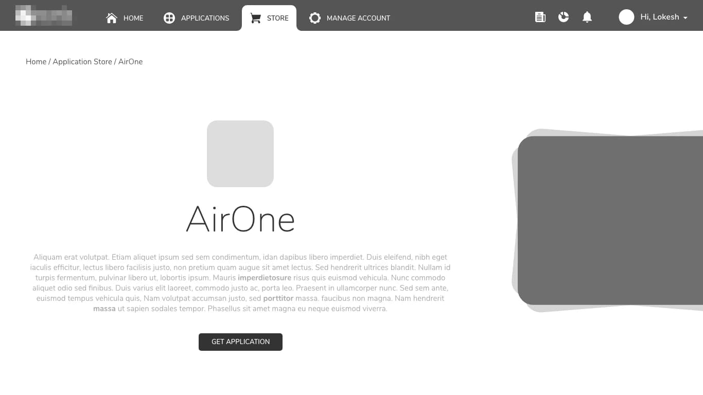
Axar7 redesigns products that have grown harder to use, starting from research rather than a new coat of paint. For Kallix we ran stakeholder interviews, journey mapping and usability tests, then rebuilt a cluttered application portal around four destinations and one obvious action per page.
Updated
01How it works
UI/UX redesign, step by step
- 01
Research first
When retention falls in a product that grew feature by feature, the cause is often too many visible surfaces rather than a missing feature. For Kallix we started with stakeholder interviews, mapped the journeys users actually take, and ran usability tests before committing to decisions.
- 02
Fewer destinations
That research shaped a new information architecture that puts the highest-value flows first. Navigation came down to Home, Applications, Store and Manage Account, with breadcrumb trails on leaf pages so people always know where they are.
- 03
One obvious action
An application page shows the restraint: a breadcrumb trail at the top, the application's name and description in the centre, and one primary action, Get Application, beneath them. Clearer affordances make it obvious what can be clicked or changed.
- 04
Checked with users
Usability testing validated the decisions along the way. The redesign reduced friction on critical tasks and improved qualitative pilot feedback by making high-value actions easier to find and complete.
02Scope
What we build
- Stakeholder interviews and journey mapping
- Usability testing to validate decisions
- A new information architecture
- Redesigned screens with micro-interactions and clearer affordances
03Proof
Where we have done this

04Stack
What we build it with
- Figma
05Questions
Common questions
Do you start with research?
Yes. Kallix's overhaul began with stakeholder interviews, journey mapping and usability tests, and that research shaped the new information architecture.
What does a redesign deliver?
For Kallix: stakeholder interviews, user journey maps, usability testing, a new information architecture with navigation built around Home, Applications, Store and Manage Account, breadcrumb trails, micro-interactions and clearer affordances.
Which tools do you design in?
Mainly Figma, from the first wireframes to the finished screens.
How do you keep a dense screen readable on a phone?
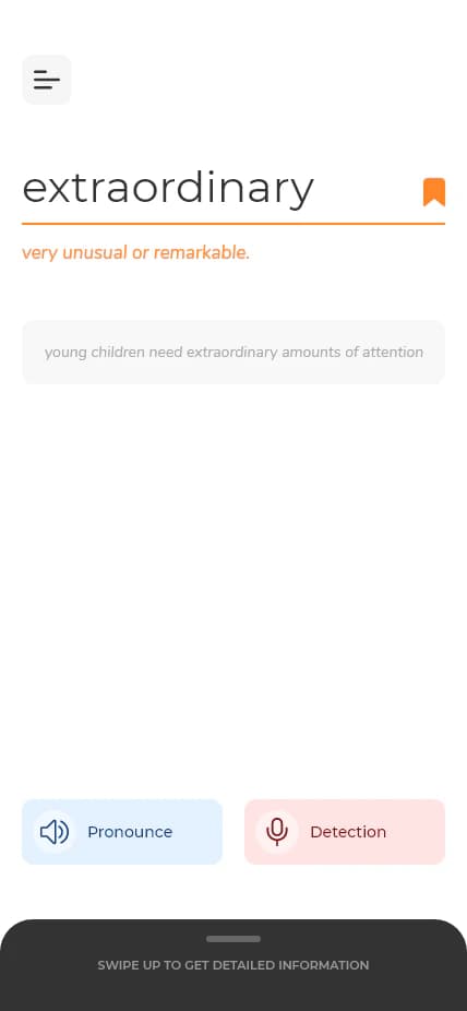
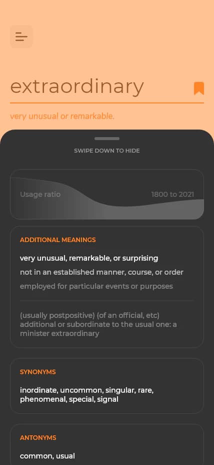
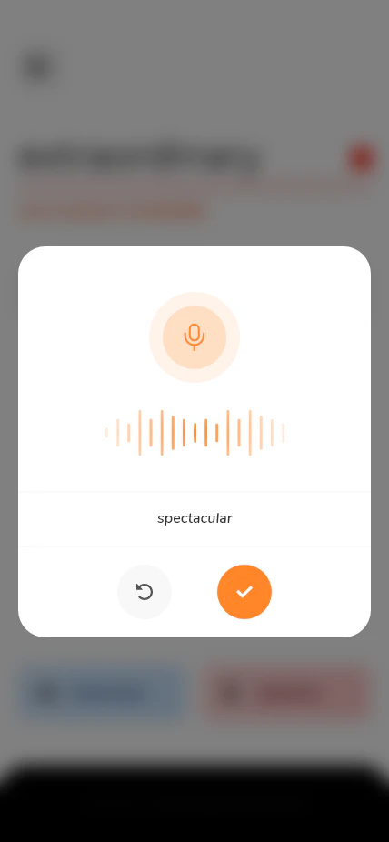
By putting the essentials first and the depth one swipe away. On the phone, DictionarE's entry screen shows the term, a one-line definition, an example sentence and two large buttons, one to hear the term and one to search by voice. Usage since 1800, additional meanings, synonyms and antonyms sit in a dark sheet that slides up from the bottom, so they do not crowd the first answer.
Do you design websites as well as product screens?
Yes. Equity Films, a production studio that uses film to help investment management firms connect with their stakeholders, needed a public site and an admin portal. Its homepage leads with the studio's positioning, set in white over full-bleed film footage, and navigation stays at five items, Our Work, Services, The Team, About and Contact, so the work is never more than a click away.
How long does a redesign take?
It depends on the project. Simpler requirements take a few weeks, up to a month; complex builds take months.
06Related
Related services
- Full-stack web developmentAxar7 builds web products end to end, from the interface people use to the APIs, data pipelines and infrastructure behind it.
- Figma plugin developmentAxar7 builds Figma plugins and publishes its own: QuickCraft, an all-in-one content generator plugin for Figma with more than 15,000 downloads on Figma Community.